Back to Dude Intelligence for Education Main Menu
Comparative Maps allow you to compare your results with other schools in a selected geographic location. This data is updated on a monthly basis. For example, if you are viewing your Comparative Maps in March 2017, then you will see data from the first of March 2016 through the end of February 2017.
- Use the Comparative Maps drop down in the top right corner of the screen to change your Map view.

Comparative Maps
Shows the number of events per student per year. The colors on the map represent the range of events as shown in the legend.

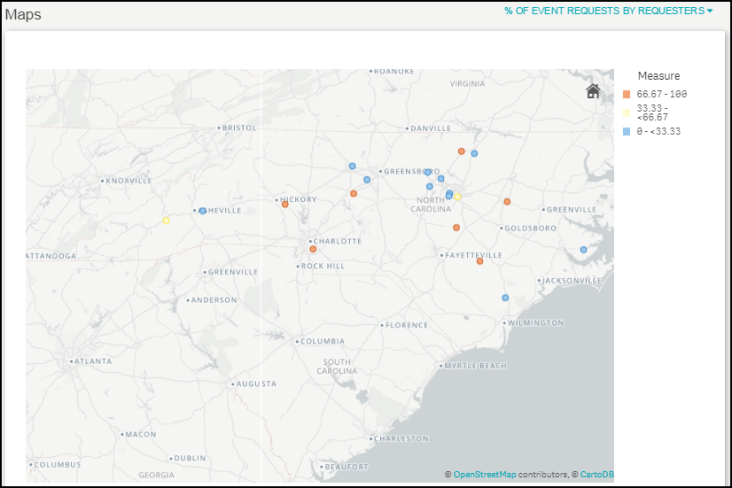
Shows the percentage of event requests made by Requesters. The colors on the map represent the event percentage range as shown in the legend.

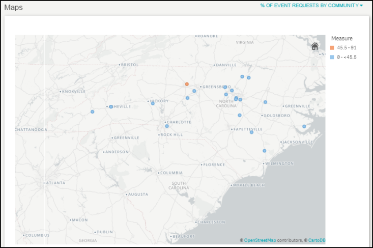
Shows the percentage of event requests submitted by Community users. The colors on the map represent the percentage range as shown in the legend.

Shows the average number of days it takes to activate permits. The colors on the map represent the average days aged range as shown in the legend.

Shows the dollar amount invoiced per student per year. The colors on the map represent the dollar amount range as shown in the legend.

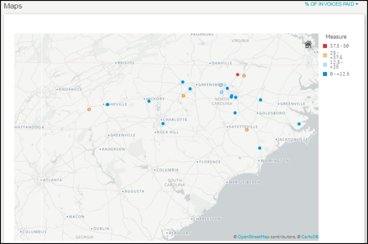
Shows the percentage of invoices paid. The colors on the percentage range as shown in the legend.

Shows the percentage of overdue invoices. The colors on the map represent the percentage range as shown in the legend.

